Mobile SEO is no longer optional. Since Google completed its rollout of Mobile-First Indexing, the mobile version of your website is the version that counts for ranking. Full stop. Every Swiss SME, every Zurich-based online shop, every Zug startup that ignores this in 2026 is actively handing rankings to competitors. The good news: the fundamentals haven’t changed drastically, but the bar has been raised. Here are the eleven most important tips we work with daily.
What does mobile friendliness mean?
The mobile-friendly category includes pages that are available to users on mobile devices without restrictions. Various aspects determine whether a website is compatible with a mobile device. These include, for example, the answer to the question of whether users can read the website texts without zooming in. Likewise, the content automatically adapts to the respective screen; users therefore no longer have to scroll. Buttons and links can be clicked perfectly because they have an ideal size and placement.
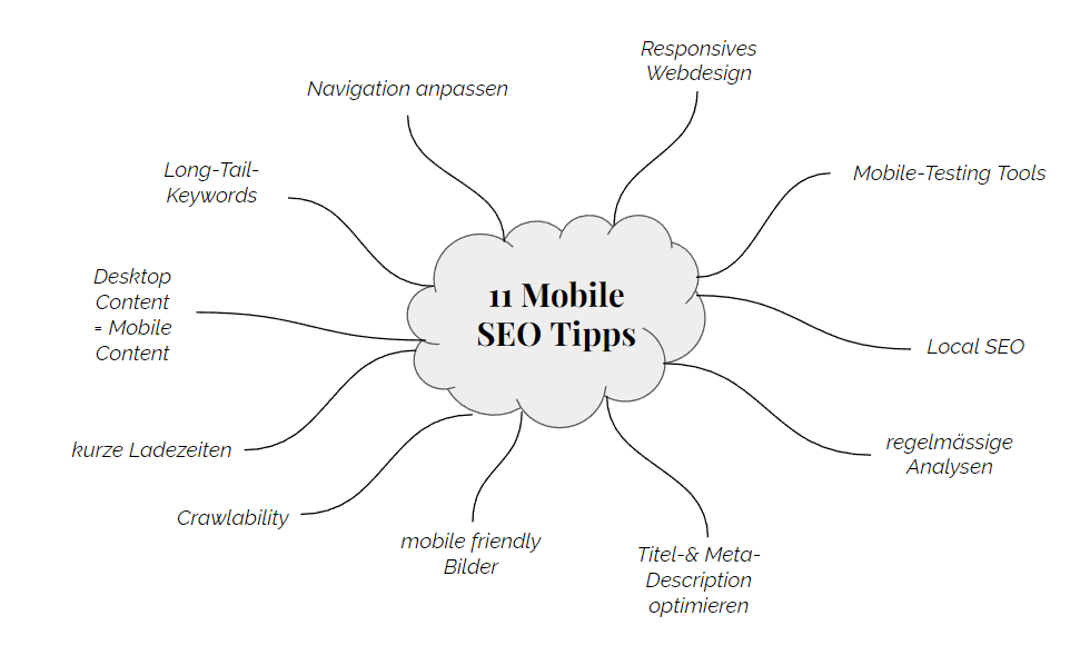
Software tools that hinder optimal page loading are undesirable. Mobile-friendliness is no longer a nice-to-have, it is a prerequisite for anyone who wants a place high up in the Google rankings. In Switzerland, where mobile internet usage exceeded 70% of all web sessions in 2026, this is especially true. That’s why ONELINE points out the top eleven for good mobile-first indexing. Optimal mobile website optimization starts at different website areas, covering both technical conditions and content quality.
The content of the website is ideally accessible for the Googlebot
Mobile websites perform best in a Google ranking if the Googlebot indexes and crawls them completely. In this regard, the robots.txt file serves as a good instructional aid because it provides the Googlebot with information for crawling a website. Experienced web designers cleverly formulate the instructions, which is why no blocking of content happens. Because this causes negative consequences: No error-free interpretation of CSS or JavaScript files takes place. According to ONELINE, marketers pay attention to images: the bot crawls and indexes them effortlessly. After a comprehensive crawl, it decides whether a website meets the requirements of a mobile device or not.
Periodical analyses increase the success of Mobile SEO
Google updates suggest the importance of regular checks. Periodic analyses and the measurement of success metrics represent an indispensable approach. Dwell time, bounce rate and CTR. These three terms are more than just words. The trio acts as a measurement indicator for the success of a website. Insofar as the three show a declining trend, there may be a faulty web design. Likewise, unsatisfactory redirects and slow loading times cause deterioration. All deficiencies have a negative impact on mobile ranking. Therefore, Google’s Search Console acts as useful support. Free of charge. Likewise, Google Analytics acts as an aid. For checking the loading speed of a website, it is worth using the Google tool called Page Speed. Marketing managers who take these tips to heart are on the right track to the top.
Short loading times increase the ranking success
For mobile devices, the loading time stands for the success of an online presence. Why? Quite simply because users leave a page. They will bounce if they have to wait a long time for the content. Fatal for the website operator. Annoying for the user. Our experience shows that Swiss e-commerce sites losing more than 3 seconds on mobile load time see bounce rates climb above 55%. That’s revenue walking out the door. Are there other reasons why loading speed plays a key role in successful Google Mobile-First Indexing? Yes. Because hardware as well as connectivity issues occupy a more important place for mobile users than for desktop users. That’s why experts optimize their images, minimize their code, count on browser caching and reduce redirects. The aforementioned tips are self-evident, yet a large majority tends to neglect them.
Optimize title and meta descriptions for a better Google Mobile-First Indexing
What is the crucial difference between a mobile device and a desktop? The screen. With mobile website versions, users and designers have a smaller screen size at their disposal. Therefore, it pays to adapt to the mobile page version. URLs, titles, and meta descriptions are short, concise, yet informative. Ideally, the quality of the information content is maintained. Another reason that calls for short and snappy headlines is called time. These days, time is a scarce commodity. Readers skim web page information first: the titles. Based on this, they decide whether to stay on the page or not. That’s why responsible web designers never neglect meta descriptions and headings. This optimization is also one of the essential components of mobile SEO.
The underestimated effect of the mobile testing tool
Does the user cope effortlessly on the mobile page version? Webmasters answer these questions by providing the URL of the page in question. Then they look at the result. In less than a minute, the tool tests all redirects. Furthermore, webmasters receive the test result as a screenshot. Practical, isn’t it? The human brain works with images. Marketing managers can then see how the website looks to the search engine on mobile devices. They also get all the problems that the tool found, along with user experience issues specific to small screens. In particular, small font sizes are among them. What we see in practice: many Swiss business websites fail this test on the first try, often due to overlooked legacy CSS.
Desktop and mobile content show no differences
Experts offer their visitors an identical mobile and desktop version. Otherwise, the primary content with which webmasters want to rank is equivalent to the desktop variant. After all, Google only uses the website content that the mobile variant displays for search and indexing. Attention: Web designers who intend to provide their mobile pages with less content than the desktop variant run the risk of generating less traffic. Provided they have activated Google Mobile-First Indexing. As a result, the search engine is no longer able to present the entire content.
The little known effect of images
Short loading times stand for fast loading of website content and images. Besides, the recognizability of the content plays an important role. Experts use an image editing program. Before they send their images out into the world, they reduce the view to the display size of a smartphone. In this way, they can see in advance what the image will look like in mini format. Thanks to this approach, webmasters can also answer the question of whether the main subject is of sufficient size. Details? Well recognizable. If so, the images will decorate the mobile website. Since users use their mobile devices especially outdoors, out-of-place reflections often occur. High-contrast images effectively counteract an undesirable mirror effect. Next Generation formats like WebP and AVIF are worth using in 2026 too, shaving meaningful kilobytes off every page load.
The secret of long-tail keywords
They are not forgotten. ONELINE emphasizes on which keyword variation the focus lies in mobile SEO. Short-tail and long-tail keywords prevailed in search queries. The latter are used less frequently by users, but they carry an important advantage: “Lined, snow-repellent women’s boots for winter”. At first glance, this combination seems very specific. That’s right. Nevertheless, it outperforms the short-tail variant because users bounce from non-specific keywords. There are fewer page views and even fewer conversions.
A majority is still not aware of why mobile search engine optimization places higher demands on a website than classic SEO measures. With the desktop variant, companies were happy if they landed among the top ten in the search engine rankings. With a mobile device such as a smartphone, different laws prevail. These are tougher, because smaller screens display fewer search results. Informed webmasters aim to land in the top three results. Long-tail keywords make this far more achievable, even for smaller Swiss companies competing against established brands.
Perform Google Places optimization and benefit
Location-based. This is the way mobile searches usually go. Google doesn’t ignore this. Therefore, the search engine predominantly integrates search hits from its own local search. However, this service is by no means possible without a separate registration. In addition to the address, entrepreneurs also enter descriptive texts and images of their local businesses. In order to offer users reliable results, Google carries out a special verification process. Especially in the field of mobile SEO, local search queries play a central role. For businesses in Zurich and Zug, a fully optimized Google Business Profile is often the difference between appearing in the local pack or being invisible to nearby searchers.
Adjust links and navigations to mobile devices
Even though a majority of website owners are not overly focused on external links affecting their websites, it is worth consolidating the links correctly. These links should also be counted for the mobile page versions, at least until the canonical tags are clear. For internal links, on the other hand, a lack of attention would be negligent. Webmasters need to check that all links are properly available on the mobile website version. Breadcrumbs on mobile pages provide more navigational clarity while freeing up screen space. Google benefits from them as well. Some online sites choose a slimmer website menu for their mobile devices, but this choice can impact PageRank flow and should be handled carefully. Our web development team addresses this in every mobile audit we run.
Responsive Design is the key to success
Numerous websites still maintain separate URLs for mobile and desktop versions. The m.domain.tld solution serves as an example of this. Unfortunately, this is not the correct way. It leads to errors, inferior performance and problems. Although Google technically supports such page configurations, they are not an ideal solution. Responsive design acts as the proven key to success because it adapts to the space available depending on the device size. In 2026, there is simply no strong argument left for maintaining a separate mobile subdomain.
Conclusion
Mobile SEO poses special challenges to webmasters because they have a smaller screen size at their disposal. The goal is no longer to grab one of the top ten spots but to land among the top 3 hits on Google. Keywords need to reflect this reality, with long-tail variants increasing ranking chances considerably. Mobile search engine optimization is not displacing classic SEO so much as it is becoming synonymous with it. Users are on mobile. Google follows the user. So should your website strategy.
This article was written by the ONELINE team. We have been supporting Swiss companies in digital transformation for over 10 years , from SEO and SEA to AI automation and lead generation.
Frequently Asked Questions
What exactly is Google Mobile-First Indexing?
Google uses the mobile version of your website as the primary basis for indexing and ranking. If your mobile site has less content or worse performance than your desktop version, your rankings will suffer regardless of how good the desktop version looks.
How do I check if my Swiss website is mobile-friendly?
Use Google Search Console under the “Mobile Usability” report, or run a quick check with Google’s PageSpeed Insights. Both tools are free and give you actionable issues to fix. For a more thorough audit of Swiss business websites, our team at ONELINE regularly runs comprehensive mobile SEO checks.
Does mobile SEO differ from regular SEO?
The principles overlap strongly, but mobile SEO adds extra layers: page speed matters more, local signals carry greater weight, and screen real estate is limited so titles, meta descriptions and navigation need to be sharper. Long-tail keywords also tend to perform better on mobile due to voice search and conversational queries.
How important is local SEO for mobile searches in Switzerland?
Very important. A large share of mobile searches in Switzerland have local intent, especially in urban areas like Zurich and Zug. A fully optimised Google Business Profile combined with consistent NAP data across directories significantly increases your chances of appearing in the local map pack.
{“@context”: “https://schema.org”, “@type”: “Article”, “headline”: “Google Mobile-First Indexing – 11 Mobile SEO Tips”, “description”: “”, “author”: {“@type”: “Organization”, “name”: “ONELINE”, “url”: “https://oneline.ch”}, “publisher”: {“@type”: “Organization”, “name”: “ONELINE”, “logo”: {“@type”: “ImageObject”, “url”: “https://oneline.ch/logo.png”}}, “datePublished”: “2021-02-05”, “dateModified”: “2026-06-26”, “mainEntityOfPage”: {“@type”: “WebPage”, “@id”: “https://oneline.ch/en/blog/1263/”}}