
In principle, SEO measures of web designers are a well-known phenomenon. Charles Darwin spoke of “survival of the fittest” , only those who adapt to changing conditions survive. The same logic applies to websites. And in 2026, one thing is non-negotiable: Mobile SEO. Over 60% of all Google searches worldwide now happen on mobile devices. In Switzerland, and especially in business hubs like Zurich and Zug, that number is even higher among commuters and on-the-go professionals checking search results between meetings. User behavior caused this shift , and Google followed. So did the ranking algorithm. This is why ONELINE dedicates this article to mobile-first indexing and what it means for your website today.
Mobile-first indexing is not a luxury, but an indispensable asset
Jeff Bezos once framed his approach to customers as a host creating a feel-good atmosphere at a party. Every detail matters. Google thinks the same way about its users. The search engine adapts to how people actually search , and since the majority now search on smartphones, mobile-first indexing is no longer a feature. It is the foundation. Google’s Googlebot crawls and evaluates your mobile version first. The desktop version is secondary. Full stop. Companies that have not internalized this in 2026 are not just falling behind in rankings , they are actively losing customers to competitors who have.
Mobile devices topple the classic desktop from its throne
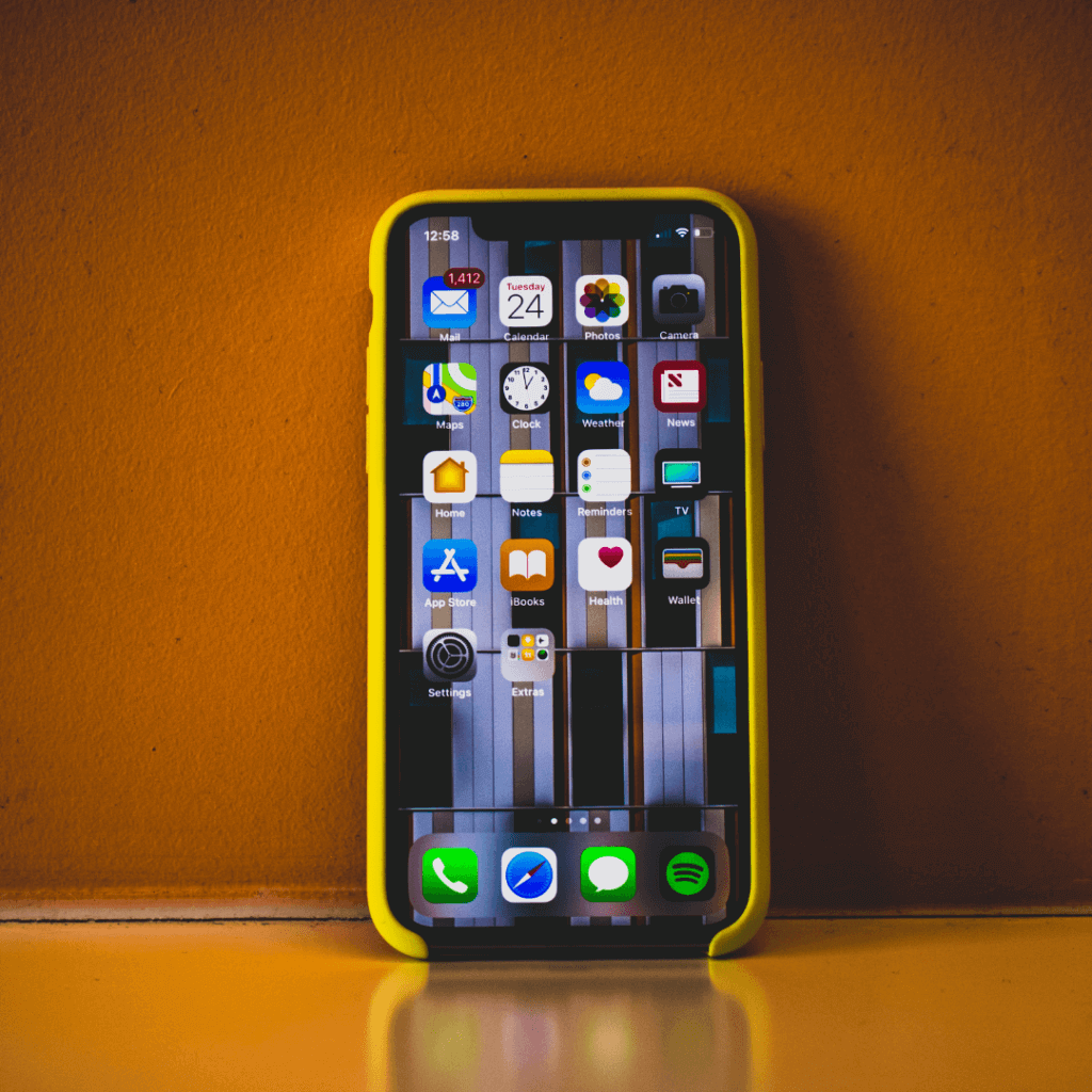
Regular algorithm updates keep Google’s ranking factors continuously current. Quality and timeliness, always with a focus on the user. That is why Google introduced its mobile-friendly update years ago , processing the surge in mobile search queries that has only accelerated since. Mobile SEO is now a central pillar of any serious search engine optimization strategy. Google has made it official: mobile ranking factors carry more weight than traditional desktop signals. This is not a future scenario. It is the present reality, and it has been for some time now.
How did mobile ranking gain importance in Google?
In 2013, experts flagged mobile ranking as a coming priority. Two years later, Google rolled out its “mobile-friendly” update , and with it, a fundamental shift in SEO. Websites optimized for mobile web design gained ranking advantages almost immediately. By late 2016, Google confirmed that mobile ranking factors outweighed desktop signals. Mobile-first indexing became the default for all new websites. Today, in 2026, it is the standard across the board.
The reason is straightforward: smartphone usage continues to climb globally. In Switzerland, mobile internet usage has grown steadily year on year, with urban centers like Zurich seeing particularly high mobile traffic across every industry vertical. What we see in practice: B2B companies in Zug that historically relied on desktop traffic are now seeing more than half their organic visits come from mobile. The ones who adapted their sites early are reaping the benefits. Those who didn’t are fighting for visibility they’ve already lost. SEO is not forgiving in that regard.
How is a website optimized for mobile devices?
A mobile website needs legible fonts, appropriately sized tap targets, and zero tolerance for unnecessary whitespace or broken layouts. Screens are smaller. Attention spans shorter. Patience thinner. Webmasters use Google’s mobile-friendly test tool to check whether their pages meet baseline requirements. But passing that test is just the entry ticket , not the finish line.
Page speed is where most sites lose. ONELINE consistently advises compressing website resources, eliminating render-blocking JavaScript and CSS, and properly formatting images for mobile. Slow server response times are a deal-breaker , both for users and for Google’s Core Web Vitals assessment. Our experience shows that even a one-second improvement in load time can meaningfully reduce bounce rates, particularly on mobile. For lead generation pages, that translates directly into more enquiries.
Mobile SEO requires a new arrangement of website content
Optimizing for mobile means rethinking how content is structured and displayed. Responsive design handles this elegantly , the same HTML and URL, with the layout adapting to screen size. The Vary Response header signals to search engines how the content has been configured. Practical and efficient.
WordPress remains dominant as a CMS, and most modern themes handle responsiveness well out of the box. But responsiveness alone is not enough. Buttons need to be thumb-friendly. Navigation must be intuitive with one hand. Fonts readable without zooming. Links spaced so users don’t accidentally tap the wrong one. Flash is long gone , no loss there. What matters now: a properly configured robots.txt file so Googlebot can crawl the site without obstruction, lean page sizes to respect limited mobile data, and a clean technical foundation. This is also where professional web development pays off , the details that look invisible to users but are very visible to algorithms.
As Philip Rosenthal put it: “If you stop getting better, you’ve stopped being good.” That applies perfectly to mobile ranking. There is always a finer point to address. Emails and newsletters adapted for mobile. Structured data correctly implemented. Canonical tags in order. The work is ongoing.
It is time to perform mobile search engine optimization to enhance the user experience
Mobile devices are woven into daily life. That trend is not reversing. Web designers now build mobile-first and adapt to desktop second , not the other way around. Some markets are already effectively mobile-only in terms of traffic behavior. Switzerland is not far behind. Companies in Zurich and across the German-speaking cantons that are still treating mobile optimization as a secondary concern are taking a real business risk: lower rankings, fewer visitors, weakened brand credibility. And in competitive markets, that gap widens fast. Mobile SEO is more important than ever. Not tomorrow. Now.
This article was written by the ONELINE team. We have been supporting Swiss companies in digital transformation for over 10 years , from SEO and SEA to AI automation and lead generation.
Frequently Asked Questions
What exactly does mobile-first indexing mean?
Google uses the mobile version of your website as the primary basis for crawling, indexing, and ranking. If your mobile site is incomplete or slow, your rankings suffer , regardless of how polished your desktop version looks.
How do I know if my website is mobile-optimized?
Google’s mobile-friendly test tool gives you a quick baseline check. For a deeper analysis , Core Web Vitals, page speed, structured data, crawlability , it’s worth working with an experienced SEO agency that can audit the full picture.
Does mobile SEO also affect Google Ads performance?
Yes, directly. Landing page experience is a key factor in Google’s Quality Score. A slow or poorly structured mobile landing page will drive up your cost-per-click and reduce ad performance. Your Google Ads campaigns and your mobile SEO are more connected than many advertisers realize.
Is responsive design enough, or do I need a separate mobile site?
Responsive design is Google’s recommended approach and sufficient for most Swiss SMEs. A separate mobile subdomain (m.yoursite.ch) is technically possible but creates additional complexity around canonicalization and content parity. Stick with responsive unless you have a very specific reason not to.
{“@context”: “https://schema.org”, “@type”: “Article”, “headline”: “Why is Mobile SEO more important than ever?”, “description”: “”, “author”: {“@type”: “Organization”, “name”: “ONELINE”, “url”: “https://oneline.ch”}, “publisher”: {“@type”: “Organization”, “name”: “ONELINE”, “logo”: {“@type”: “ImageObject”, “url”: “https://oneline.ch/logo.png”}}, “datePublished”: “2021-01-26”, “dateModified”: “2026-05-20”, “mainEntityOfPage”: {“@type”: “WebPage”, “@id”: “https://oneline.ch/en/blog/1267/”}}